


Good morning from Brooklyn! I'm celebrating a month on Substack and feeling inspired! Today, I'm sharing how I "steal" color palettes from the world around me, focusing on the recent-ish series, Andor.
What I love about seeking color inspiration is its ubiquity. It can come from anywhere: art, design, nature, or even a television show. Does anyone else get pulled out of a narrative by visual choices? I often find myself daydreaming about costumes, set design, and especially color. In Andor, the deliberate use of color to shape mood and symbolism completely captivated me. I decided to embrace this "distraction" and analyze the show's palette for my own creative work.
Below is my decidedly unscientific take on Andor’s color palette based on a few screenshots. I ended up selecting a lot of colors (it was hard not to), but three main groups stood out:
Olive-ish/mustardy greens and yellows
Indigo into Prussian blues
Rust, terracotta, and brick reds
Plus, plenty of greys and blacks for contrast.
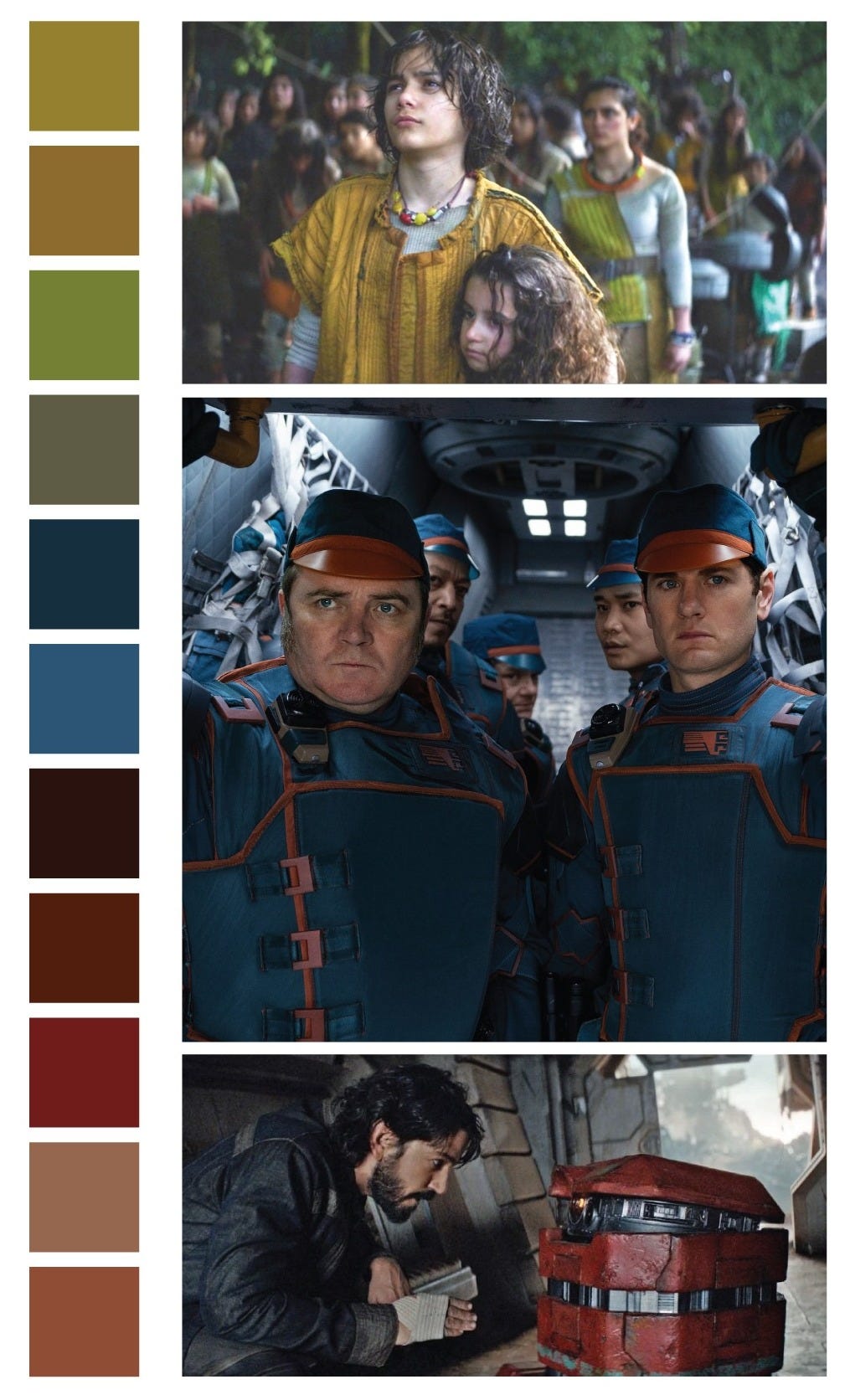

What do you notice? I see a lack of primary colors, with predominantly mixed hues, secondary, tertiary, or intermediate colors. Color science has evolved since my school days, so I'm no expert. What are your thoughts?
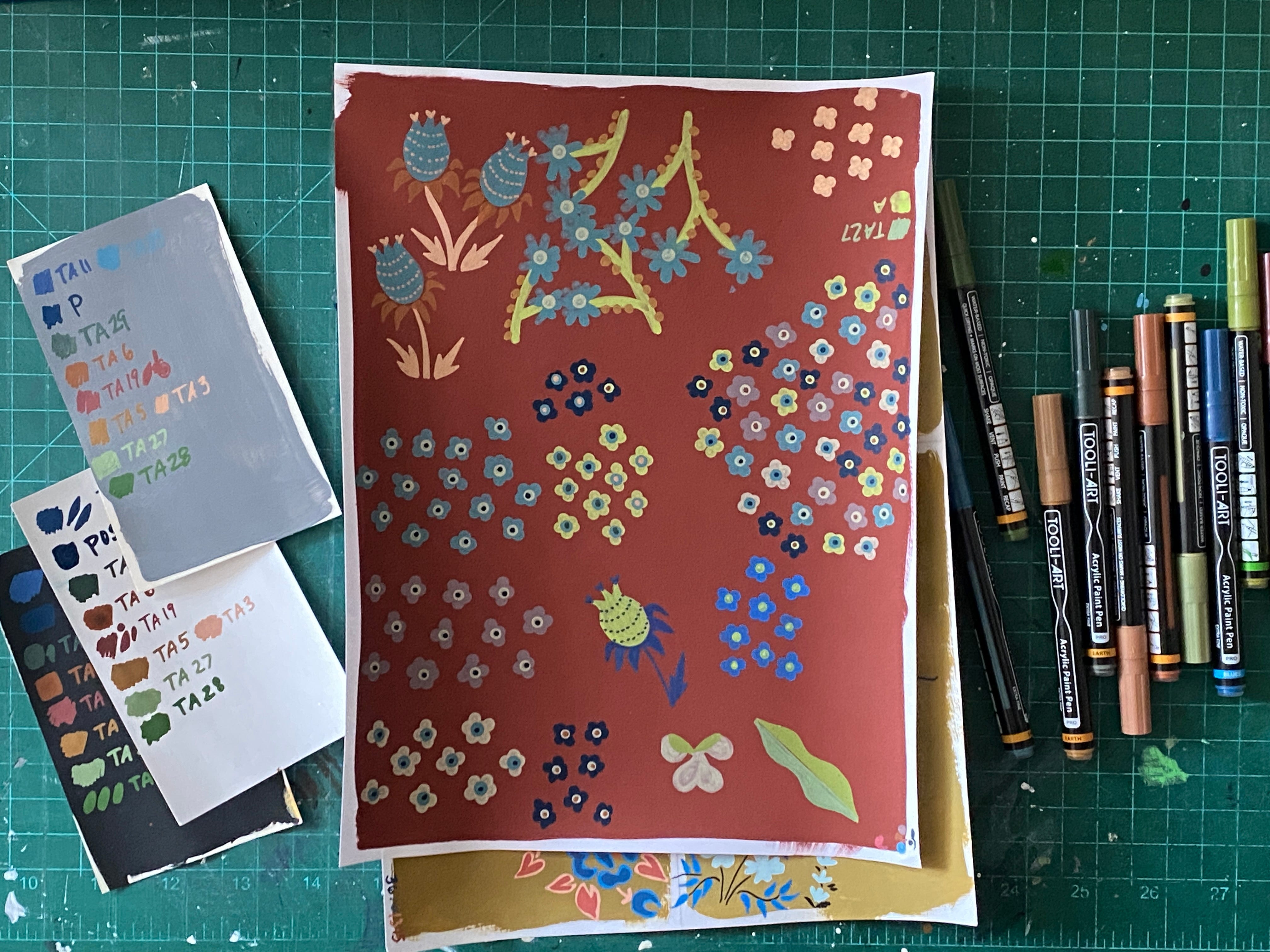
My next step was to recreate the palette with acrylic paint markers, a go-to medium. Since I wasn’t mixing paint for precision, I aimed for “close enough” with my Tooli-Art and Posca markers (Tooli-Art is quickly becoming a favorite, especially their “Earth Tones” and “Greens” collections).
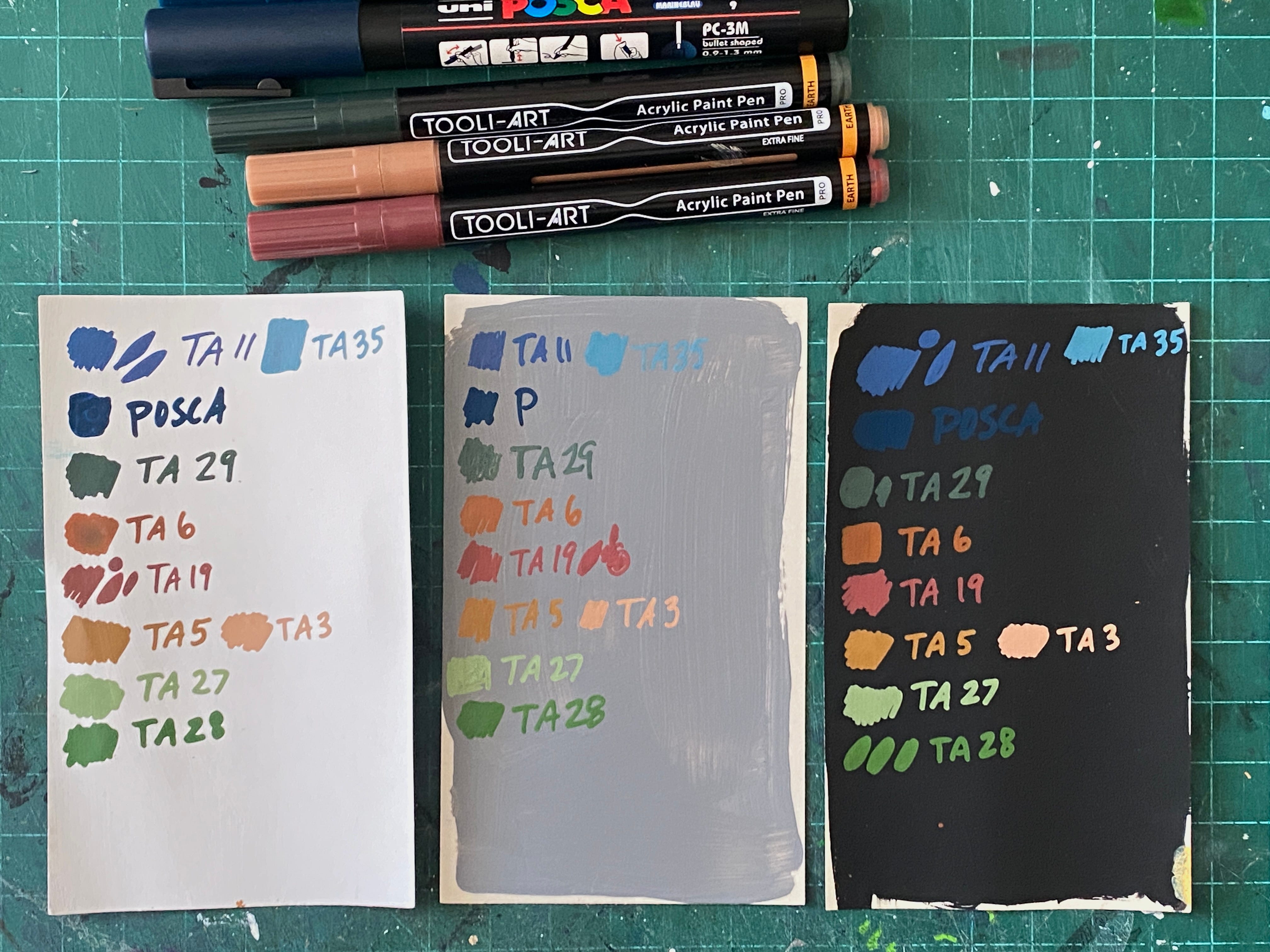
When experimenting, I like to keep things simple and accessible, so I use index cards, a cheap, fast way to test colors. (I get them at the dollar store near me.) This time, I painted each with white, gray, and black gesso to see how colors interact with different values. (I also like to take these for doodles while traveling! More on that later.)
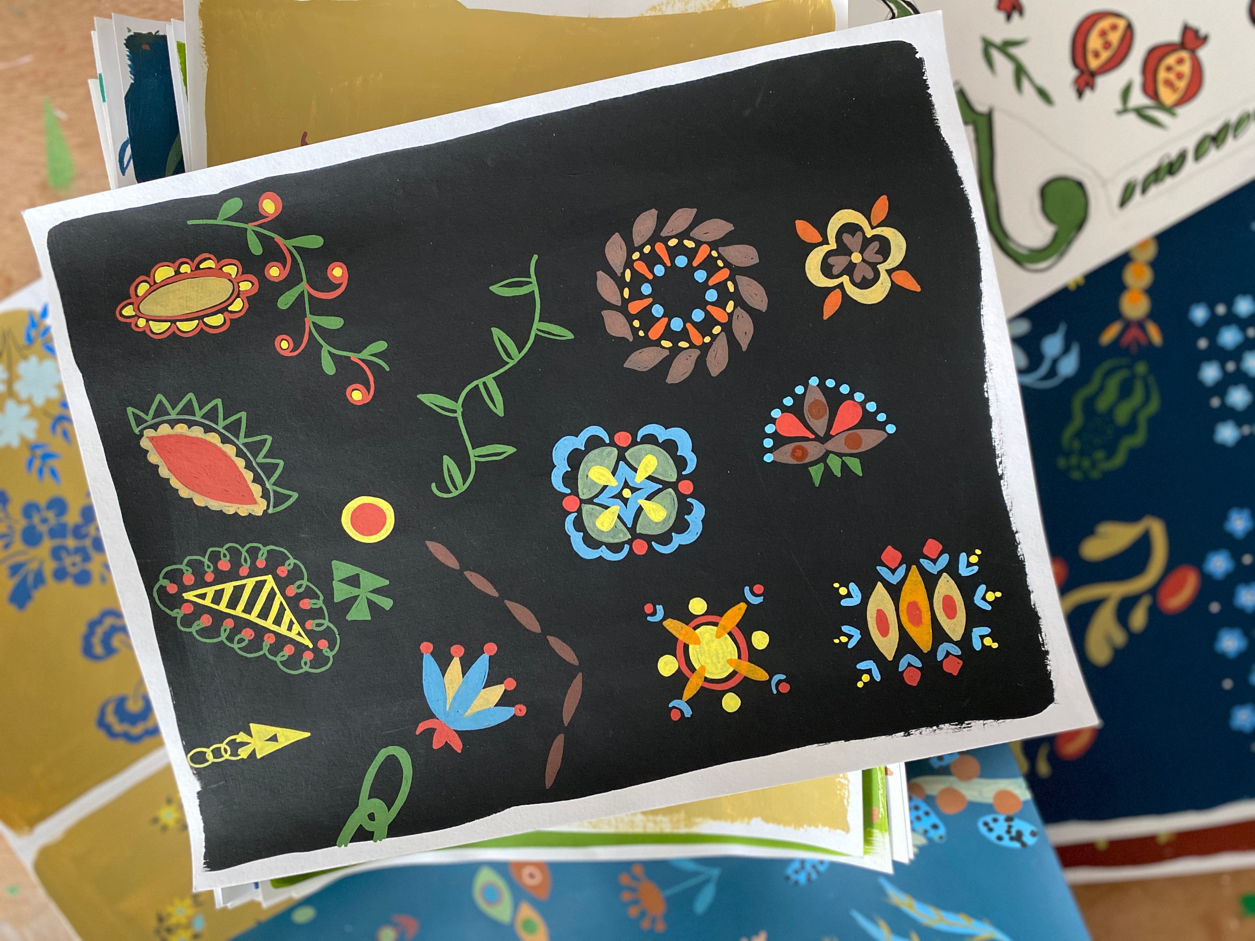
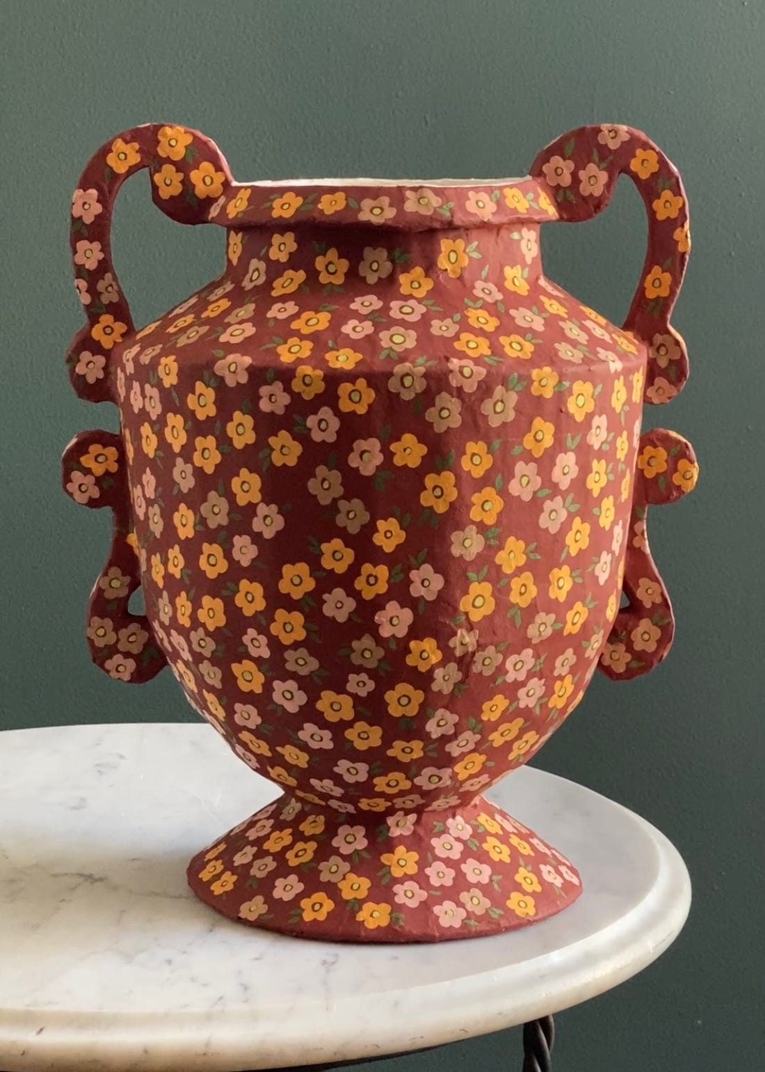
With my new palette in hand, I started sketching patterns and doodles, drawing inspiration from 15th-century herbal illustrations and other historical works. These designs will eventually adorn my paper mâché vases and trays. My sketches live on loose sheets of cardstock primed with gesso, what I call my "loose-leaf sketchbook." I used to feel intimidated by high-quality sketchbooks, but switching to this method made my process more relaxed and free.
I don’t always love every sketch in the moment, but I save them all. Frequently, they become relevant to me later. Some make it onto my vases, while others simply serve as a fun, creative exercise.
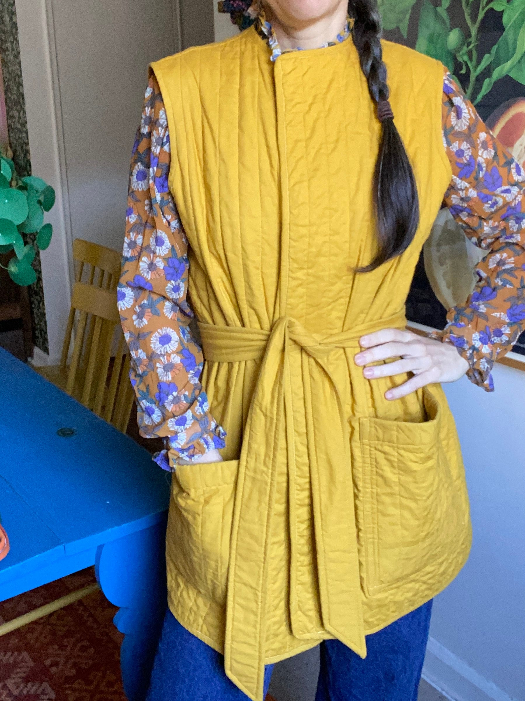
Speaking of Andor, I even made this mustard-yellow quilted vest because of the show! It was totally intentional. I loved the color and the vibe. I'd been working on a pattern for it, and now I'm thinking I should pick it back up.
Do you have any examples of media where the color palette sticks with you? Have you ever used these hues in a project later? I'd love to hear!
As always, thanks for reading and for being curious about craft with me!


Share this post