

Before the Algorithm, There Was Peter
What an anonymous designer reveals about creativity, constraint, and persistence in 1794

But here’s what I keep wondering: who, exactly, is Peter?
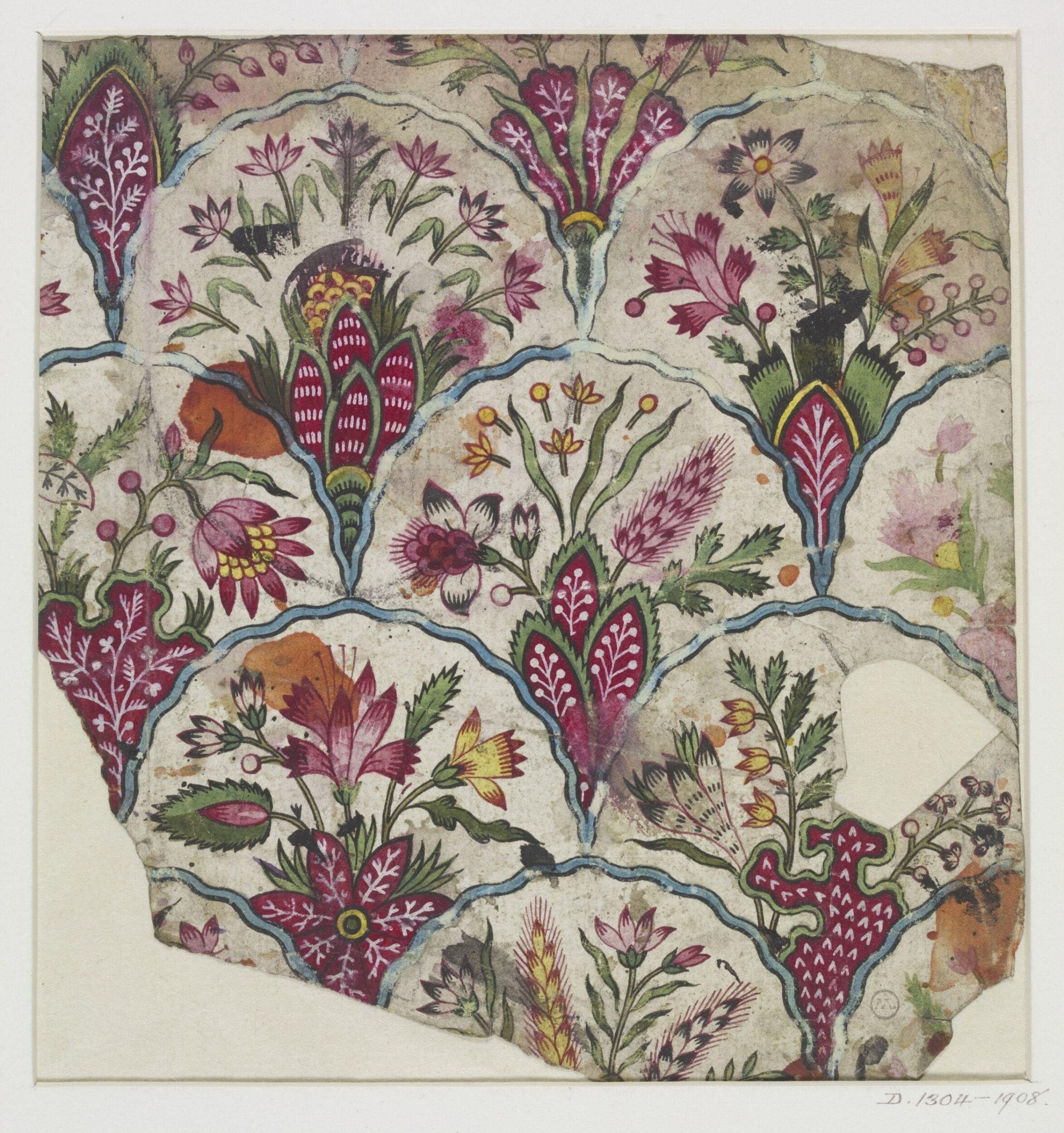
I’m staring at a painted fabric design from 1794, and the label simply says: “Peter.” No last name. No biography. Just Peter. About a third of the way in, I catch myself wondering… have you ever fallen a little in love with someone you’ll never be able to Google?
Okay, I jest, but honestly, every time I dive into the V&A archives, this happens. I show up for the artwork and end up getting attached and curious about the people behind it.


In 1794, Peter would likely have been understood as a technician, an artisan, a worker. Someone executing, not authoring. And yet 328 sample paintings survive, each careful, experimental, and alive with decision-making.
Nevertheless, we know nothing about who he was. These watercolor drawings are unlabeled for the manufacturer, the printing house, the city, or the town. Tagged simply with “Peter”. But there is so much to learn from how he worked.
I think about that a lot. How much work by anonymous people is tucked away in museum drawers, quietly teaching us anyway? There are so many creative, imaginative people who never got the fine-art treatment, so we know them only by their first names, if at all.
Small tangents on history
As I dug deeper into this collection, I began to notice faint pencil marks and handwritten notes. After some zooming and squinting, I realized many of the drawings were dated using the French Revolutionary calendar, such as Vendémiaire, Pluviôse, Fructidor, followed by l’an 3.
After a brief aside on this subject, it appears that dating this way wasn’t necessarily intended as a political statement (as I had wrongly assumed). In France, it was simply the method used to record time. For example, Vendémiaire (derived from the French word for ‘grape harvest’) began in late September and marked the start of the autumn quarter. Adopting the Revolutionary calendar was likely more about keeping up with the times than expressing any ideological stance. This perfunctory move perhaps further suggests that these drawings were primarily working documents rather than artworks created for posterity.
Which makes total sense when you think about how the process worked. In 1794, a textile design like Peter’s began as a hand-drawn working sheet, drawn at full scale in pencil, ink, and watercolor. There are several methods, but the best guess for these is that once the design was picked, it was carved into wooden blocks, one for each color, and then printed by hand onto cotton, layer by layer. The finished fabric was sold for clothes or furnishings, and honestly, the designer’s hard work just kind of melted into the cloth. Rarely do we know anything about the skilled hands that made it. This tradition (called chintz) began in India, but by the late 18th century, European workshops like Peter’s were adapting those techniques for themselves.
The stains, cut edges, chopped-off bits, annotations, and crossed-out ideas make more sense when you realize these sheets were tools. They were never meant to be precious. But, they are precious to me!!
What to learn from Peter
If you’ve been following along, you know I’ve explored designers who work within tight palettes and deliberate constraints. Peter takes that idea even further, showing how persistence and subtle variation can make even a narrow range feel endlessly inventive. What really draws me in is Peter’s dedication to constraint.
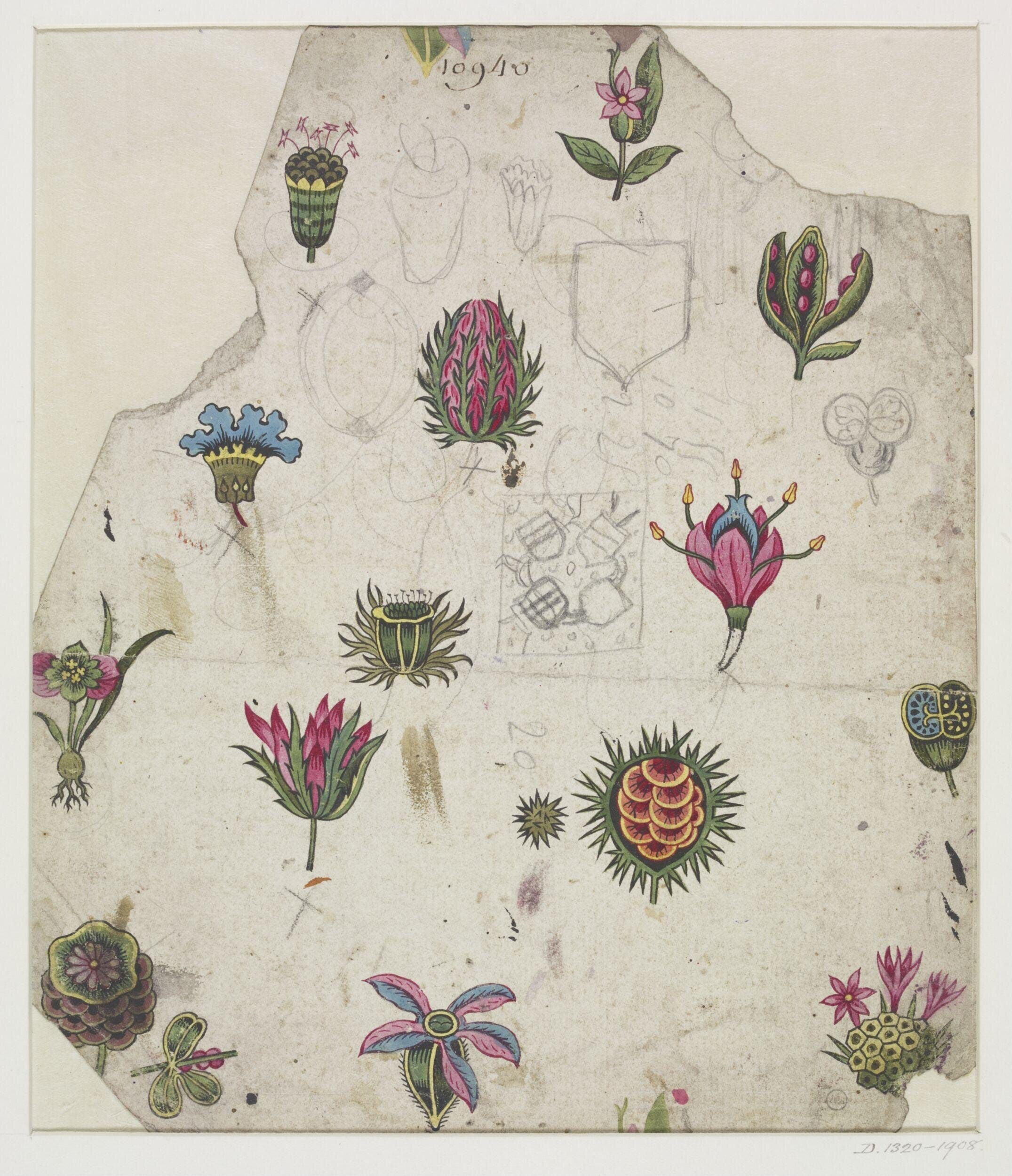
The color palettes stay tight. The scale stays consistent. Motifs repeat, but never quite the same way. Every 15 to 30 designs, you can see subtle shifts: a flattened form here, a more graphic motif there, a black background, or an even tighter color palette. A leaf becomes a vine. A symmetrical flower loosens. A familiar form shifts in scale or rhythm. You can spot blooms that are wholly recognizable, such as roses, tulips, and carnations, before they morph into strange amalgamations, unusual combinations, and surprises.
The variations feel almost exhaustive. As much time and attention as I put into my own work, I don’t know that I’ve ever pursued a single idea with this level of persistence, and I love seeing the results. His steadfastness makes it obvious how even minute changes can radically affect flow, balance, and relationship.


But the lessons go beyond admiration. Peter’s work shows that iteration is discovery: exploring every possibility within a narrow set of rules reveals nuances you might otherwise miss. His limits (the same colors, motifs, and scale) actually spark invention rather than constrain it. The tiny pencil marks, crossed-out ideas, and cut-outs remind me that creativity lives in the doing, not just the final piece. Every small adjustment carries insight. In a way, Peter teaches patience, attention, and the quiet power of incremental change. Lessons that remain just as relevant to a modern maker as they were in 1794.
A small joy, applied
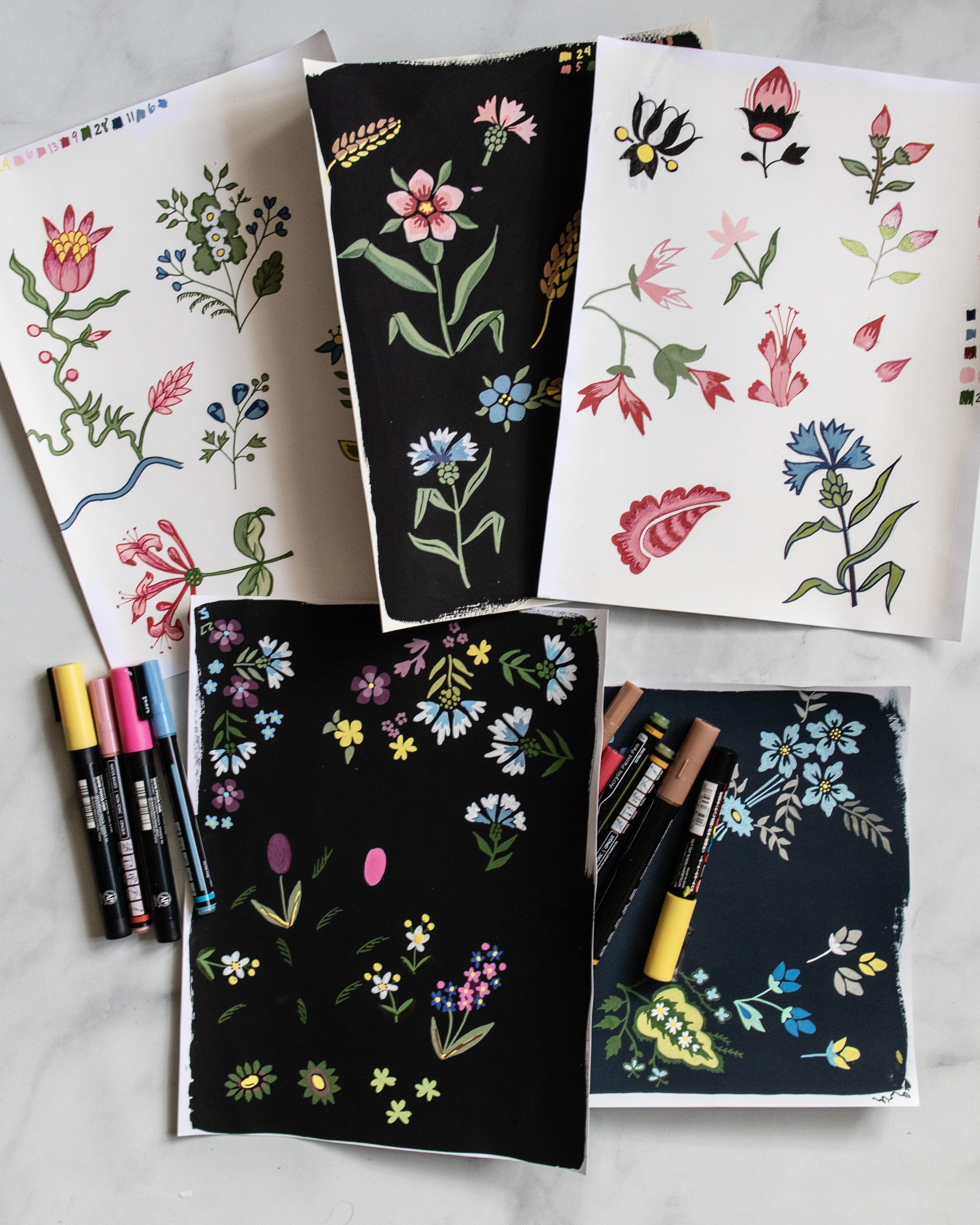
Inspired by Peter’s dedication, I wanted to see what his approach might teach me in practice. (Though I know that what I can do in a few days is just a small surface scratch compared to the more than 300 designs he produced, likely over the course of a year!!) I sat down at my studio desk, picked a few trusty paint markers, and began doodling… literally copying some of his motifs. I wasn’t trying to replicate the full rigor of his watercolors or produce a finished design for production; mostly, I was studying his forms closely and seeing which ones translated well to markers, which felt awkward, and which seemed to come alive in this medium.
The V&A labels these sheets as “watercolor,” but in 1794, the paint would have likley been called aquarelle, which just means water-based paint that could be applied opaquely. Today, in our modern categories, it behaves more like gouache, perfect for clearly showing motifs rather than delicate, transparent washes.
I experimented with color, echoing Peter’s limited palettes of greens, pinks, black, and white, and after a few tries, I realized I preferred the black background; it gave the motifs a surprising depth, just as Peter’s careful adjustments give his patterns rhythm and life.
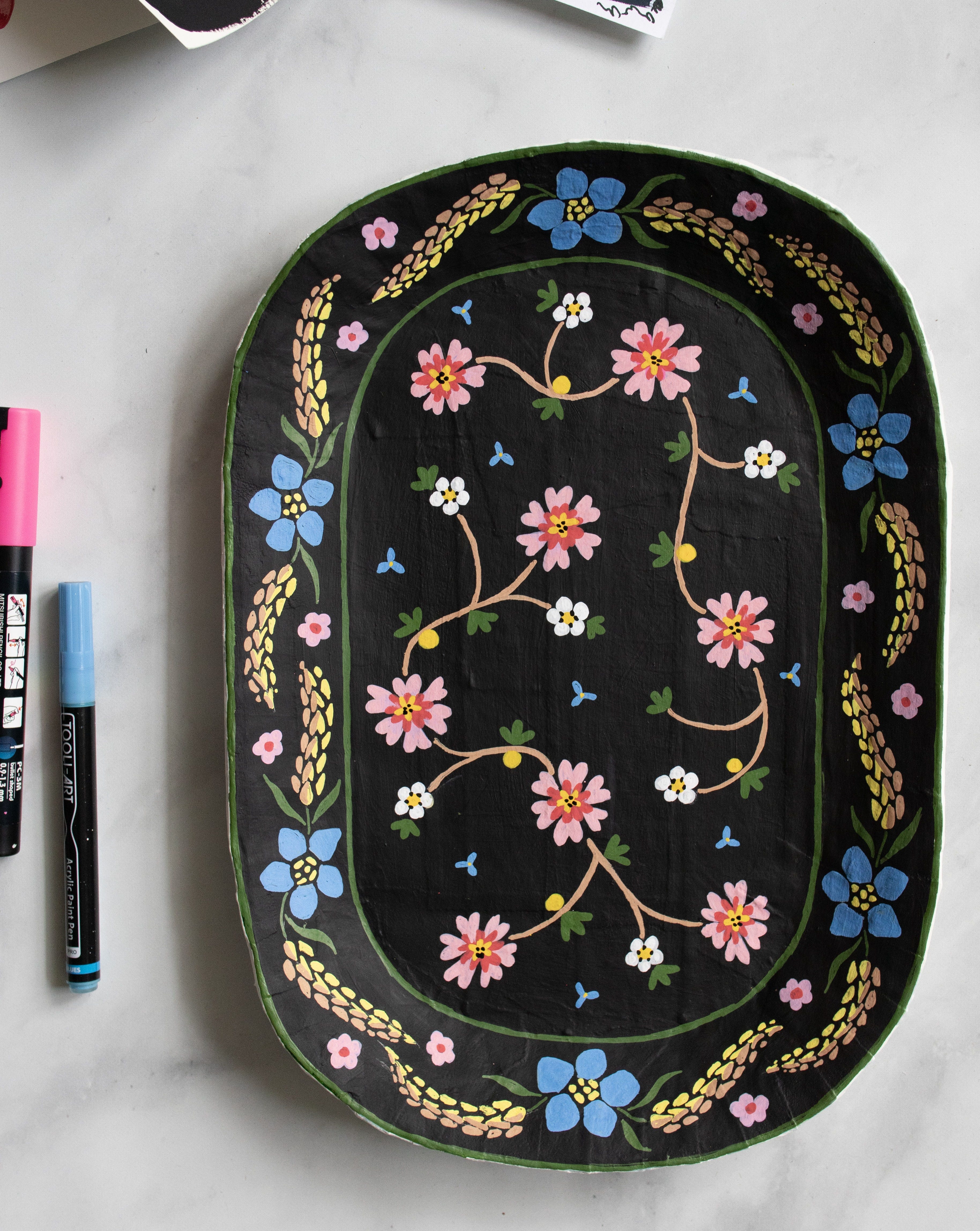
Next, I combined floral motifs from several of Peter’s patterns onto one of my papier-mâché trays, testing how repetition, scale, and palette could interact across a three-dimensional surface. Each decision felt informed by the same principles I’d just studied: subtle variation, thoughtful spacing, and small, deliberate shifts in form. The final step will be sealing it with matte varnish, but even before that, I love how it turned out.
Working this way, following his constraints, exploring his motifs, and letting my hands discover possibilities, gave me a tiny, tiny sense of Peter’s method. While my practice is just a surface exploration, there’s always more to notice, more subtlety to uncover, and more inspiration to take into my next project. The work I put in over a few days will never approach the sheer volume of Peter’s output, but I love knowing I can return to his designs again and again, always noticing something new.
If you’d like to explore Peter’s work, the V&A has all 328 of his designs available in their online collection. Have a look and see which motifs catch your eye; do any feel surprisingly modern for 1794? Or make you wish the fabric still existed for a project of your own? I’d certainly like to have a skirt/dress/pants/vest in a number of them!
I think that tray is, and I don’t say this lightly, one of the most beautiful things you’ve made on here.
Wonderful story!